
This blog explains what cross-tabulation analysis is, how it’s traditionally been done with research agencies, and quantilope’s approach to making data analysis quick, intuitive, and automated.
Table of Contents:
What is cross-tabulation analysis?
Cross-tabulation (commonly referenced as crosstab and sometimes called a contingency table), is basically a way to merge all the data from each question in your survey into one file so you can analyze the relationships (aka, the cross-analysis) of two categorical variables. Before we keep going - a categorical variable is a type of variable that describes characteristics or attributes that cannot be measured numerically - think: regions, genders, satisfaction, etc.
When you analyze two categorical variables (let’s say, gender and age) in a cross-tabulation table for a certain survey question, you’re able to get a read of the survey data for that question among a very specific cut of your target audience - both in counts and percentages.
Cross-tabulation tables can help identify patterns and relationships between two variables that may not be immediately apparent just by looking at the raw data alone, in turn helping you make more informed business decisions.
Back to Table of Contents
How do I use cross-tabulation analysis?
Many traditional research agencies provide a cross-tabulation as part of their standard survey data deliverables. This is typically a massive Excel file with (sometimes hundreds of) separate sheets that each show a different survey question cut by a set of categorical variables. The research team will set up these categorical variables in what’s often called a ‘banner’ - so that each sheet of the Excel file has the same banner of categorical variables across the x- or y-axis.
Let’s say you’re a clothing retailer and you want to see how age and gender impact consumers’ buying habits. By creating a cross-tabulation table and viewing your data set in this format, you’ll be able to see how many people in each age group and gender ‘category’ purchased a particular product or service from your business. Using these insights, you can tailor your marketing efforts and product development to better suit your ideal target audience.
As another example, consider a researcher who wants to examine how race and education level are related to attitudes about social justice issues. Within a cross-tabulation table, they can see how many people in each racial and educational category hold certain attitudes or behaviors, which can help them identify potential areas for action.
The examples are endless - with researchers using cross-tabulation tables for anything from public health research (healthcare access per demographics), to political polling (voting patterns per region), to brand health (satisfaction levels by generation).
Back to Table of Contents
When should I use cross tabulation analysis?
Cross-tabulation analysis is a valuable tool when you want to understand the relationship between two or more categorical variables. It's particularly useful for:- Identifying hidden patterns and trends: Cross-tabulation makes it easier to discover associations that might not be apparent when looking at individual variables in isolation. For instance, cross-tabulation might reveal a surprising correlation between customer satisfaction and a specific product feature.
- Evaluating experiment effectiveness: Assess the impact of different treatments or interventions across various groups. For instance, you could compare the success rates of two medical treatments across different age groups or genders.
- Quality control/risk analysis: Pinpoint potential problems or defects in manufacturing processes by examining the relationship between variables such as product quality and production factors.
In general, cross-tabulation is a versatile and straightforward approach that can yield valuable insights into categorical data relationships (i.e., data that falls into distinct groups).
Back to Table of Contents
Benefits of cross-tabulation analysis
Above we saw the many instances brands might leverage cross-tabulation analysis in market research, and for good reason. Here are some of the main benefits of using this type of analysis on your data sets:
Identifying patterns and relationships:
As mentioned above, cross-tabulation allows researchers to identify patterns and relationships between two or more categorical variables that might not be so easily visible in a raw data file. This can help them understand how different groups within their data set are related, and how they may influence each other to feed into your business strategy.
Segmenting data:
By using cross-tabulation, researchers can segment their data into different subgroups to focus on how certain sectors of their target audience may differ from the total survey responses. This can be particularly useful to guide marketing strategies, as different segments of your audience might respond differently to communications or branding efforts.
Visualizing data:
Cross-tabulation tables display respondent data in a clear and concise way. For researchers who stick to one or two main categorical ‘banners’, they can scroll through their file of survey questions and know exactly where to find certain data cuts. Some cross-tabulation tables even include statistical analysis to quickly visualize significant changes in the data between two categorical groups.
Back to Table of Contents
Crosstab survey questions
Crosstab tables will simply display the survey responses from any survey questions you ask in your questionnaire. To help put this into more context, below are a few examples of what an individual tab within a cross-tabulation file might show, based on the following survey questions:
“How often do you use social media per day?”
One tab of the cross-tabulation file might show the data from this question, with survey statements down the x-axis (once a day, a few times a day, once an hour, several times an hour, etc.). Across the top of the tab, you’d have your ‘banner’ which would show a number of categorical variables - perhaps age, gender, region, income, device type, etc. You can use this tab to (for example) hone in on what percentage of those with an iPhone use social media several times a day compared to those with an Android
“Where do you shop for groceries?”
With this survey question, your survey statements on the x-axis of the cross-tabulation table might include ‘mass retailer’, ‘local mom-and-pop shop’, ‘regional grocery store’, etc. In this case, a brand might want to look at how region impacts who shops at a mass retailer compared to a local chain of grocery stores.
“Which brands of soda do you buy?”
With a question like this, a soda brand might be keen to know which brands of soda consumers are buying, based on their consumption frequency or brand loyalty (two categorical variables they’d place across their y-axis in the crosstab). Down the side of the table, they’d have the list of soda brands asked about (be it Coca-Cola, Pepsi, Fanta, Sprite, etc.)
Back to Table of Contents
Examples of cross-tabulation analysis
Using the questions above, below are cross-tabulation examples showing what these column percentages might look like for each categorical variable - each of which would be shown on a separate Excel sheet.
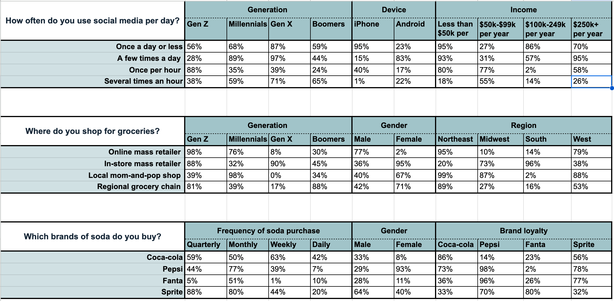
^ Note this screenshot was created using a random number generator as a simple mockup.
With quantilope's cross-tabulation there's no manual work needed to create these banner points or to add statistical testing, simply select your sample group, which questions you'd like to focus on, and which questions you'd like to split the data by. Export to Excel, and start digging into your crosstab data set!


How to interpret and report cross-tabulation results
Interpreting and reporting cross-tabulation results involves a few key steps:
-
Examine the cross-tabulation table: Look for patterns or trends in the frequencies. Are there certain combinations of categories that occur more or less frequently than others?
-
Assess statistical significance: If you conducted a statistical analysis like a chi-square test, look at the p-value. Is it below your significance level? This indicates whether the observed association is likely due to chance or a real relationship. On quantilope's platform, all significance testing is applied automatically without any manual calculations required; if there's a statistical significance, the data point will be outlined in red or green when hovering over with your mouse - depending on if it's higher or lower than other data points within the chart.
-
Summarize your findings: Once you've analyzed your cross-tabulation results, clearly call out where there are significant associations between your variables in your chart headlines. These callouts make it very easy for stakeholders to capture key takeaways and feel confident in the results.
Back to Table of Contents
Data set analysis with quantilope
By now we’ve gone through the benefits of crosstab analyses and why many market researchers leverage them to visualize and understand their data set. But what if there were an even simpler and automated way to analyze your data, so you didn’t have to manually set up those categorical variable banners or comb through data tables in an Excel sheet?
This is exactly what quantilope founders envisioned when developing the end-to-end platform as a way for researchers to seamlessly set up and analyze survey results. With quantilope, while it's possible to export your survey responses to a cross-tabulation file (as shown above), every survey question is automatically part of the platform's analysis tab, allowing users to slice and dice their variables by any subgroup of survey respondents without ever leaving the platform.
So, rather than opening up an Excel crosstab file to a certain question and scrolling over to that categorical banner point, quantilope users can select a question from a dropdown menu, and cut that data by any other available variable within the study in a matter of seconds - with significance testing included.
Want to see quantilope's data analysis in action? Get in touch below for a live tutorial of the platform!