After wrapping up a research study, are you typically left with a data file wondering how to display your survey results in an impactful way?
That’s where market research dashboards come in, to visualize survey data so that it’s digestible, interesting, and actionable.
Table of Contents:
- What is a market research dashboard?
- Importance of market research dashboards for survey data visualization
- Creating a market research dashboard with quantilope
- Additional market research dashboard examples
- Why choose quantilope for your market research dashboard needs?
What is a market research dashboard?
A market research dashboard is a centralized location where stakeholders can easily access your survey insights (kind of like infographics, but with more interactivity). It’s important to have this single source of truth when it comes to final survey metrics, making it easy to share the findings with stakeholders.
However, to do so, effective data visualization tools are key so that the insights are easy to understand at a quick glance.
Back to Table of Contents
Importance of market research dashboards for survey data visualization
Survey data is only helpful if it’s easily understood. Having an Excel spreadsheet with every single response in numeric values isn’t always helpful for stakeholders and key decision-makers to quickly extract actionable insights. Compare this to interactive dashboards where viewers can see significance testing, browse a variety of chart types (stacked bar charts, pie charts, spider charts, heat maps, trended line charts, word clouds, etc.), and watch new data update these charts in real-time. The visualization of data is also helpful to show where differences in survey questions arise due to demographic variables such as male vs. female or younger generations vs. older generations.
Survey data visualization not only makes survey responses quickly digestible, but it also makes it easy to compare new data back to original benchmarks over time with things like trended line charts as shown below from quantilope’s direct-to-consumer mattress tracker:
![]()
Data visualization is an efficient way to breathe life into your survey data sets, beyond a standard market research data output like a crosstab file.
Back to Table of Contents
Creating a market research dashboard with quantilope
Part of quantilope’s end-to-end consumer intelligence platform includes charting automation and dashboard generation. Platform users can begin to build data analysis charts as soon as respondents start to complete the questionnaire, with any new data automatically updating those same charts as your fielding progresses.
Users can save their chart creations to the platform’s reporting tab, organizing their charts into different report sections (i.e. demographic data, brand-related KPIs, customer satisfaction/net promoter score (NPS), marketing/advertising metrics, etc.). From there, users can drop any or all of these saved charts from the reporting tab into their final interactive dashboard. Just like in the reporting tab, charts will continue to update with real-time data, making it an ‘always-live’ dashboard until field is complete. For researchers running tracking studies, these charts will even continue to update with each new future wave as well, minimizing the manual workload.
Because companies often have several teams with different objectives (i.e. sales, marketing, product development), quantilope enables you to create a variety of dashboards to focus only on each of these teams’ performance indicators. Final dashboards are shareable through a single URL link and can be password protected for additional security if needed.
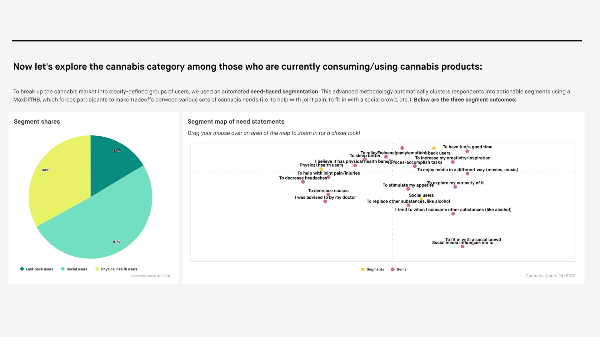
Below is a preview of quantilope’s cannabis category understanding dashboard to get an idea of what this interactivity looks like on a final dashboard!

Additional market research dashboard examples
Below are a few other additional quantilope dashboards showing a variety of business use cases, methodologies, question types, and data visualizations.
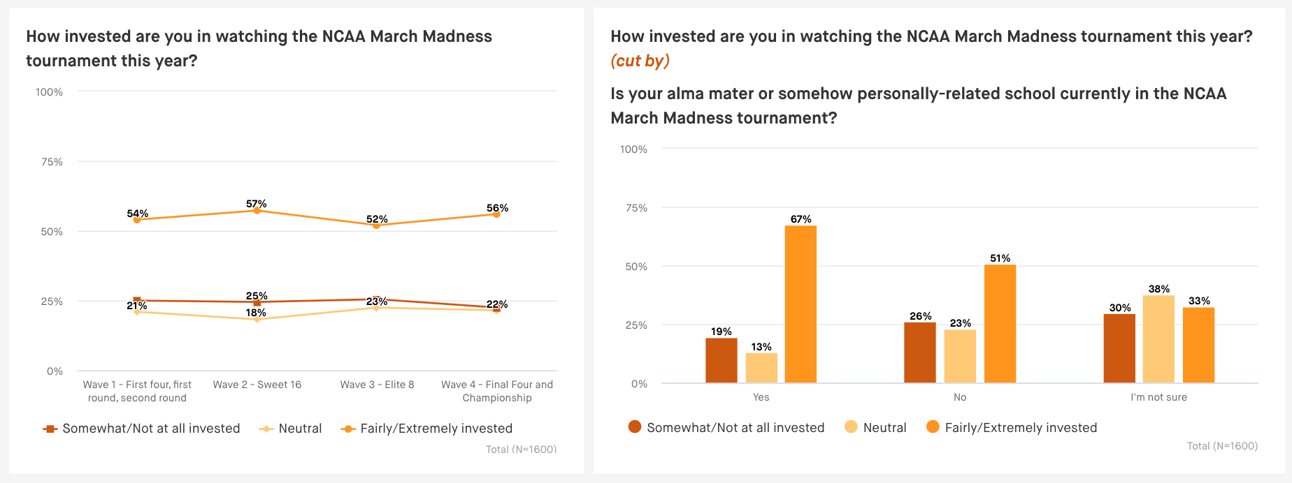
2023 March Madness Tracking:
This march madness study shows what a quick-cadence tracking study would look like in a market research dashboard. The study ran every few days across each of the major rounds of the tournament, tracking metrics such as viewing behavior, viewing device, bracket performance, and more.
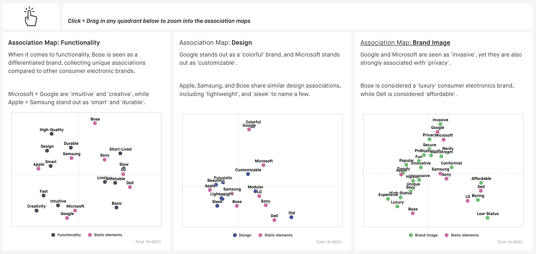
Consumer Electronics:
quantilope’s consumer electronics study included two advanced implicit methodologies - the multiple implicit association test and the single implicit association test. Check out what those advanced method charts look like, showcasing consumer feedback to consumer electronic brands such as Sony, Microsoft, Apple, and more.
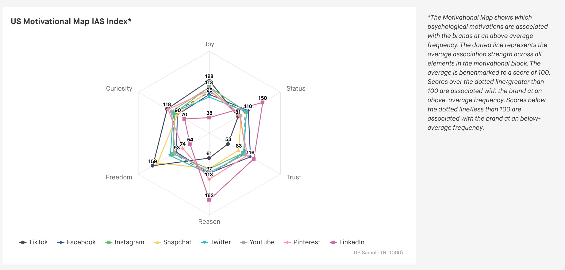
Streaming and Social Platforms:
This study is another example of a quantilope dashboard showing advanced method data from survey research - this time showcasing implicit consumer associations around streaming and social platform providers such as Netflix, Hulu, Instagram, Twitter, etc.
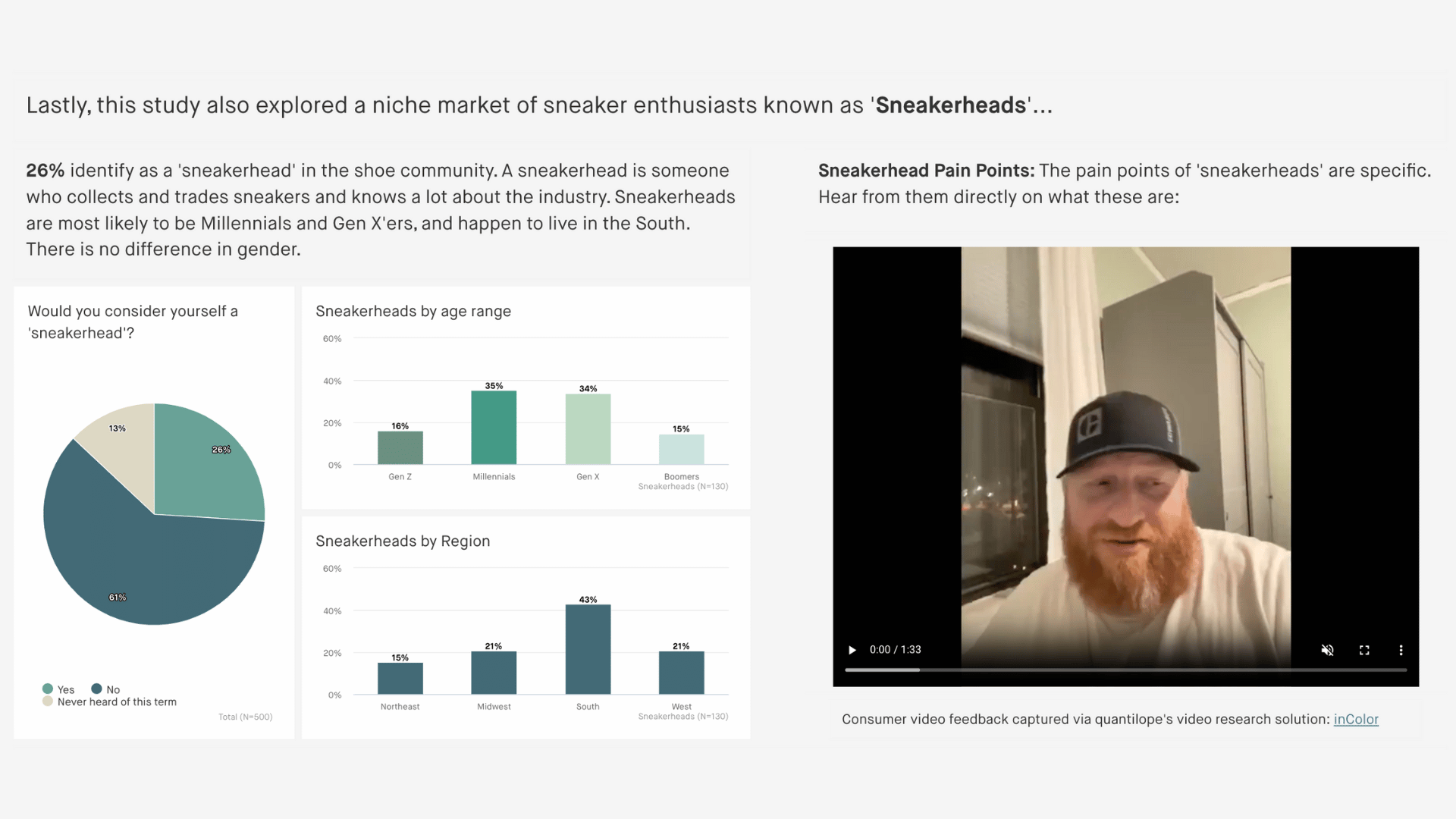
Sneaker Category Study
quantilope’s dashboard capabilities aren’t limited to just quantitative data visualizations. For those running qualitative video research studies through quantilope’s inColor solution, they have the option to incorporate video showreels directly into their market research dashboard. See below for an example in the sneaker industry:
Why choose quantilope for your market research dashboard needs?
quantilope streamlines every step of the market research process - market research reports included. Through the use of quantilope’s dashboard tool, users can quickly add real-time data charts to monitor results, visualize the data in fresh and exciting ways, and incorporate any of their own brand colors, logos, images, and so on. Data analytics is one of the most exciting steps of a research project, and you shouldn’t put in all that work to be left with a slide deck that’s not actionable or interesting enough to present to key stakeholders.
To learn more about quantilope’s data visualization and dashboard capabilities, get in touch below!